Open Space & 311 Requests
A data visualization project examining the relationship between open space access and city service responsiveness across Boston neighborhoods.
01
The Challenge
My initial theory: wealthier neighborhoods get to reinvest in the parks that made them desirable in the first place, while under-resourced neighborhoods never get pulled into that same loop.
I paired two Analyze Boston datasets: Open Space, which maps every publicly designated park, playground, and protected green space in the city, and 311 Requests, a continuously updated log of every service request residents file, such as potholes, missed trash pickups, and broken streetlights, tracked by what, where, when, and whether it got resolved. On their own they're just civic records; I wanted to see whether together they told a connected story about equity.
02
Discovery & Insights
A nearly flat trendline
A scatter plot comparing open space per capita against 311 requests per capita, neighborhood by neighborhood, came out almost flat: a slope of roughly +0.04. Meaning, more open space didn't correlate with fewer service complaints.
Underserved on Both Fronts
I expected open space and service responsiveness to correlate in some way. Instead, the data suggested some neighborhoods are underserved on both, a more troubling story than the one I started with.
Messy Records & Inconsistent Data Quality
Inconsistent naming and a 311 system mid-restructuring meant I had to verify things I'd otherwise have assumed were reliable. Carefully wording the final insights was critical to not overstating certainty the data didn't support.
03
Design Process
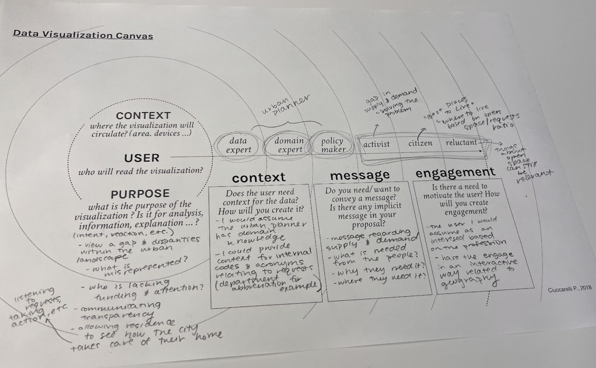
Phase 1: Understanding the Data
Before building anything, I dug into the Open Space dataset (572 rows, 27 columns covering ownership, acreage, zoning, and protection status) and the 311 Service Request log, using Python scripts and Excel to check metadata, catch inconsistent naming, and confirm the data actually came from official municipal GIS records.
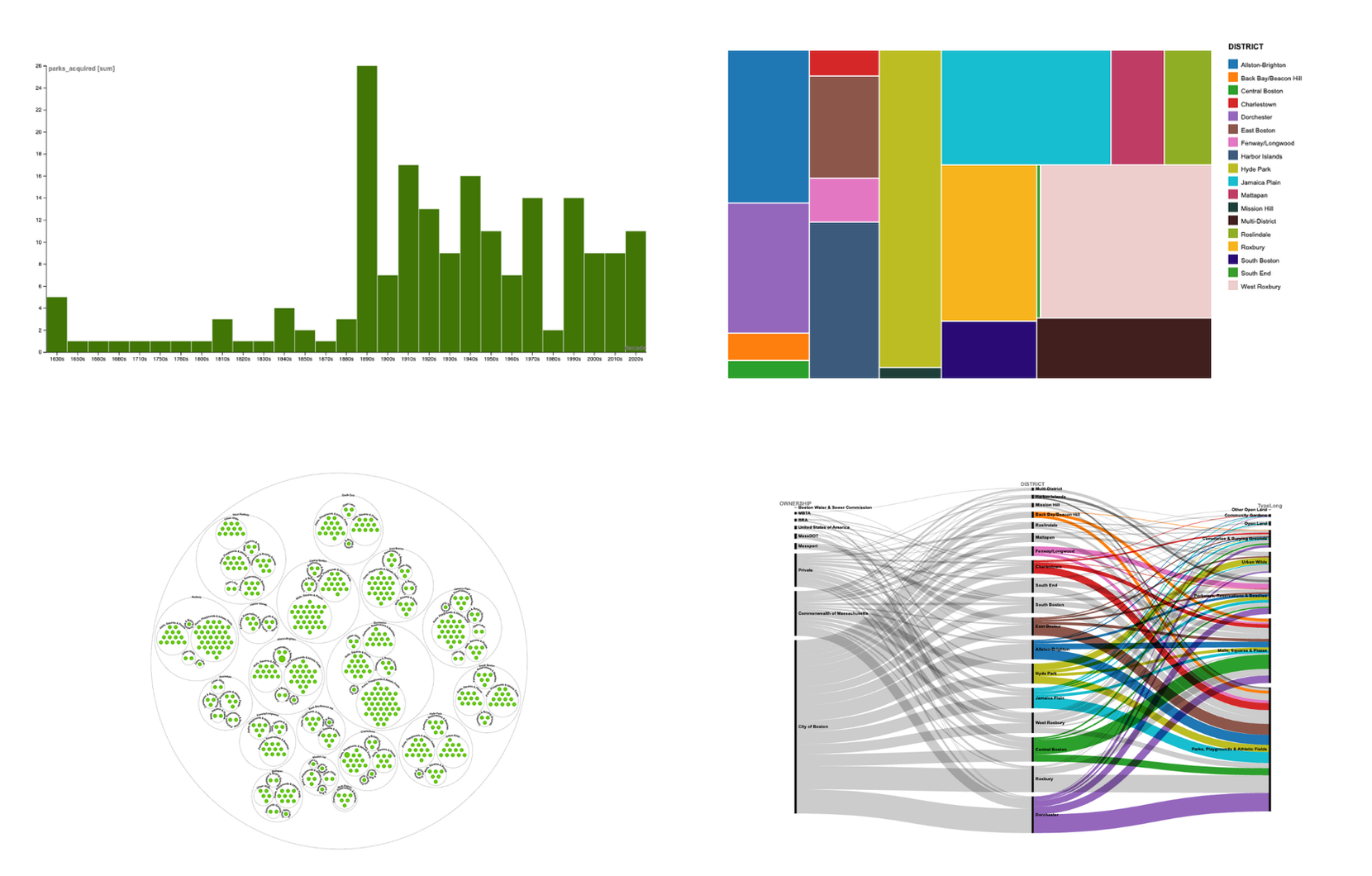
Phase 2: Visualizing the Data
I tested the cleaned data against different chart types, bubble clusters, a treemap, a decade-by-decade bar chart, a Sankey flow, in Tableau, RAWGraphs, and Kepler, to see which columns and rows actually paired well together and which gaps in city service were worth highlighting.
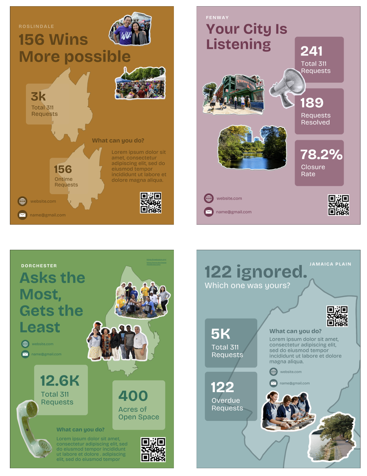
Phase 3: Communicating the Data
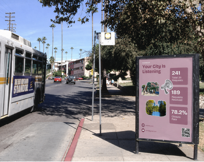
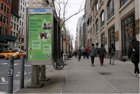
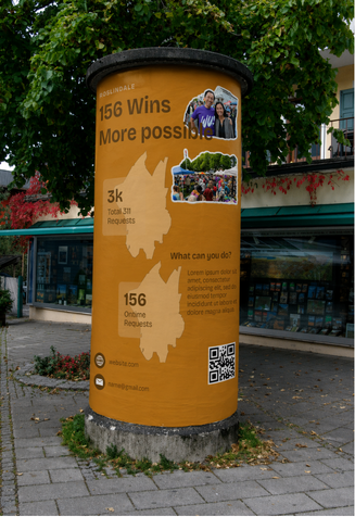
The strongest findings became four neighborhood posters, each with a provocative headline ('122 Ignored,' 'Asks the Most, Gets the Least'), localized 311 stats, a 'What can you do?' call to action, and a QR code, designed for a park or bus stop, not a dashboard.
04
The Solution
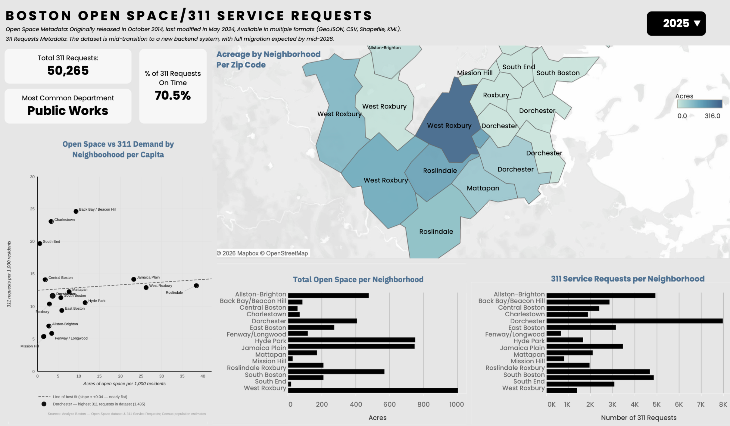
An Interactive Dashboard
Four linked views (KPI cards, a choropleth map, the open-space-vs-311 scatter plot, and paired bar charts) built in Tableau so a viewer can trace one neighborhood's whole story, hovering it highlights that neighborhood across every view at once, without losing the citywide picture around it.
Designed for a Community, not a Classroom
Mocked up in the places residents already pass through, a bus stop, a street-corner, a lamppost wrap, the posters are meant to put civic data in front of people who would never open a dashboard, and let a QR code carry anyone curious the rest of the way.
05
Reflections
Data Can Tell Many Stories
This was my first data visualization project, and it taught me that the hardest work happens before you touch a chart tool: understanding messy civic data and figuring out what story it can honestly support. The flat scatter-plot trendline reshaped my entire approach, pushing me toward a more nuanced finding than my initial theory predicted, and taught me to communicate that honestly rather than overstating certainty for a cleaner narrative. Translating the Tableau dashboard into neighborhood posters also pushed me to design for a very different audience, someone passing a bus stop with five seconds to spare, not a dashboard user with five minutes. This project showed me that data visualization is as much an exercise in editorial judgment as it is in technical execution.